Wednesday, February 29, 2012

Henry Fuseli Oedipus Cursing His Son


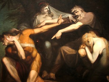
In Henry Fuseli’s Oedipus Cursing His Son he see an scene that depicts a large range of commotion and negative emotions. There is so much angst, sorrow, and pain exhibited in this painting, which goes along with many scholars’ viewpoints of Fuseli. Fuseli was an artist that loves to examine sexuality, pain, and non-harmonious nature of human kind. He constantly depicts scenes of apocalyptic nature. So it makes sense that he would paint a scene from one of the most sexually charged and twisted plays of history. Oedipus story of love, and despair is always treated as one of the best examples of the twisted nature of humankind as well as the ways we could be messed up sexually. Fuseli is described as “erudite, nervy and essentially modern painter whose grand and sometimes apocalyptic work goodness is tested, innocence has little chance and menace and violence have a sexual edge”(Michael).
Oedipus is a terrific painting that shows how much these characters are exposed. Oedipus’s son is fully nude but at the same time while being physically exposed he is also emotionally exposed. Michael Brenson’s New York Times article examines such thoughts after viewing a recent gallery of Fuseli’s work. “The sexuality, including the homoeroticism, that is restrained in Michelangelo's nudes begins to rumble in Fuseli's paintings and drawings. With Fuseli, the ideal male nude suddenly seems emotionally exposed and truly naked.”
On the more analytical side one could see how Fuseli used color and line to create and own his traits of sexuality, pain, and scenes of apocalyptic nature. First off, we have talked about Oedipus’ son being fully exposed but at the same time he is painted in color. It is unclear if this is a very tight suit or merely an artistic choice. He is the only one in the image to have any value in color. Everyone else in the painting seems to be in grey tones or white tints. The use of color could perhaps be used to show Oedipus is perhaps unfeeling and void of emotion while the son has a soul or passion.
As well the use of line creates an overall sense of transition of power. Oedipus is scolding his son so it makes sense that he is above the son. The diagonal line creates a clear sense of who has the power in this situation. The women create another line that is almost perpendicular to the Oedipus-Son line. Which connects the characters as well as adding the visual “flow” of the painting. As well the two females fill the voids of the painting while at the same time add more emotion to the image.
Every character in this scene shows a complex variety of emotions that exemplifies everything what scholars feel Henry Fuseli was trying to say about the human condition. The type of art that Fuseli was doing at the time was relatively modern and he was making bold statements that come across very clearly in his paintings. We are not a harmonious elegant society. We are corrupt, we are broken, and we will drive ourselves to apocalypse.

 Works Cited:
MICHAEL, BRENSON. "Review/Art; Henry Fuseli's Drawings of Life's Lusts and Compulsions." New York Times 04 Jan. 1991: 20. Academic Search Complete. Web. 29 Feb. 2012.

Wednesday, February 22, 2012

Baroque vs. Renaissance: "The Great David Showdown"


The Baroque period of art was a great transition from the renaissance period. Art was becoming more in-depth show tings such as emotions and movement. With that several other elements were adjust to match the preferences of the Baroque period. This is best examined by comparing Michelangelo’s David, a renaissance piece, and Bernini’s David, a sculpture that simply defines the Baroque period. 

Both sculpture represent at the biblical character, David, in his battle with the Goliath. To see the changes the Baroque period made on top of renaissance work it is important to look at the latter first. In Michelangelo’s David we see a large male, heroic –style figure. This form was chosen due to the renaissance’s obsession with humanism (the philosophy of where man has come from and where it can go, and all the great accomplishments in between). It relates to humanism because it uses the classic Greek hero or Kouros. While incorporating elements of the past, like idealism in the form, Michelangelo’s David also incorporates the idea of perspective. Originally designed to be placed above the viewer some seventy feet away it was proportioned and scaled to work for that perspective. That is the primary reason why this David is not to anatomical form. As well the line of the figure is straight up and down and in contrapposto, a very geometric composition, another trait of the renaissance. Nearly all of these “renaissance ideas” are thrown out of the door in Birnini’s Baroque David

The most obvious one comes of course in the pose. The Baroque David is in action, he is moving, he is fighting. He has a strong diagonal line, a contradiction to the liner up and down line of the renaissance. As well this form is truly anatomically correct. Baroque David also does not have as strong of ‘base’. I believe this makes him appear more human. However the most human like part of the piece I think belongs to the face. The face shows a full range of emotions, something that Michelangelo’s David lacks even one sign of emotion. There is a sense of action, courage, and fear that is represented in Birnini’s David that is otherwise disappeared from Michelangelo’s version. One thing they do share however is the sense of visual harmony, in their own right. In Michelangelo’s David there is a nice harmonic sense from his structured, and formal pose. The same can be said to a degree about Birnini’s David.

 The movement and agile, organic lines, allow for the viewer to seamlessly comb through each individual element of the design, sometimes without ever realizing it. The diagonal lines in the form allow for the viewer to start focusing on anyone spot of the sculpture but then visual trace those lines to face, and eventually back around to the staring point. One could say that chaos has created harmony in Bernini’s piece. The sense of realism one obtains from viewing Bernini’s David over Michelangelo’s is the true difference maker of what separates the Renaissance period to the Baroque.

Wednesday, February 8, 2012

Week Six: Albrecht Dürer


Albrecht Dürer was a very talented young artist that worked primarily out of Germany in the 16th century. In his painting title simply “Self-Portrait” it is very clearly that he is talented and perhaps even very egotistical. It in it’s self is a standard portrait, framed very well, but there are many oddities that surface when you look in depth. First one will notice is the pose of the painting. Unlike many earlier portraits, which use three-quarter pose, this is straight frontal and very stoic and hieratic. Another oddity is the amount of hubris that simply exudes from this portrait. He signs and dates his piece very boldly using a very light colored pigment on top of a very dark area of the painting. As well the way he paints himself makes it appear very close to northern European paintings of Christ as salvator mundi, which translates to “Savior of the World”(Stokstad 677).

But in all of these peculiar little items, there are answers based on Albrecht’s travels, and his time period. Albrecht had traveled to Italy in the early to mid renaissance so many of his attributes came for those travels. His idea of artists as creators, like God, and intellectuals also came from his travels to Italy. As well the composition of the piece, which is highly, balanced, and uses triangular composition comes from the high renaissance. To explain his hubris even further, he produced a series of work dealing with the Apocalypse that brought him huge international attention.
However, with all the peculiar things about this painting that are explained by his travels to Italy, its ore is heavily rooted in early northern-renaissance art. First we see is a very naturalistic form, rather than idealized. While he is very good looking and could have improved his looks in the painting, we do see imperfections. For example, just under his right eye (left side of the painting) we do see a blemish. This goes to prove this is naturalistic rather than idealized.
But even more northern-renaissance is he use of details, and texture. Albrecht made the skin have a nice soft glow, the hair in the coat is a different texture than his own hair, even as far as differences in his facial hair versus his head hair. He captured each individual texture so greatly in gives the viewer a chance to truly “see” the artist and even feel him through our eyes. Every little detail was thought of, which only furthers our understanding of just how smart Albrecht was. In his hand you see the slight raise on the back of his hand where his veins are. This is a very good example of a truly naturalistic painting.
            One last ting that I want to touch, which I have done with just about every other blog topic this quarter, is the artist’s use of light. Texture is defined by how light is bounced or reflected of it. In his hair we see maybe an oilier reflective surface. But in my mind the key to light in this painting is within his eyes. The watery look e get is from the artists true understanding on how reflects within our eyes. It is this understanding of the mechanics of just about everything that made Albrecht Dürer a revolutionary artist.

Wednesday, February 1, 2012

Week 5 Late Renaissance


When examining the mannerism works of “Madonna with a long neck” by Parmigianino, and “Entombment” by Potormo we can see many similar elements of design.

The first element that comes to my eye when I compare these two pieces is the form. Both images show human (or heavenly) figures in a small group while holding another human form. This is a carry over trait from the high renaissance, which is to include a mass of people, and a connection. In both images it is clear that the beings are all in the same plane. Meaning that the others acknowledge each body. However one major difference that affects the form of the individuals in these paintings is how each artist uses light to portray form. In Madonna light and shadow is used fairly realistically, which form a very natural feeling in the human bodies. This is in contrast to the Pontormo piece which floods the image with light creating unrealistic shapes and shadows in the human forms. Everything in Portomo’s piece is fairly flat, except for maybe the garments. In Madonna everything has a very natural flow to it and highlights and shadows follow the lines in a realistic way.

This leads me to consider the lines in both of these images. It seems to me that both paintings have very similar lines to form very similar shapes. Both have nice flowing organic lines in the fabrics of the garments or curtains, while at the same time have very strong lines in the architecture of the Madonna piece and the rocks in the Pontormo piece. What I also enjoy is the way line creates the environment. In both paintings in the upper left hand of the image there is a very natural flowy object. In the Madonna it is a nicely draped and shadowed curtain, while in the Pontormo piece there is a nicely rendered cloud the gives similar weight to both images.

In terms of weight, I believe this is achieved in both paintings by using another element, color, to visually alter the representative weight. In Madonna every thing seems to have a weight to it. The aforementioned natural shading and highlights do this, but also by the colors the artist chose to represent his image. The use of darker earthier tones gives a sense of visual weight as we usually assume great weight with earth type objects. No the opposite is true with the Pontormo piece. In this the use of light colors and unrealistic shading does give my eye a good idea of weight. This is mostly in part to the unnatural highlights that flatten out the image taking away any sense of a three-dimensional space.

The final element I wanted to touch on was the way the paintings are laid out. In both paintings the aspect ratio is the same. Meaning that both are narrow and tall. The similarities go even further when you examine how the artists used that space. Both fill the space with similar objects in similar places.

In all these are a great contrast that shows the variance between the kind of art that was being done in the late renaissance.